

BRAND IDENTITIES
CLIENT
SRO MOTORSPORTS GROUP
CATEGORY
Branding / Logo Design
GT WORLD CHALLENGE
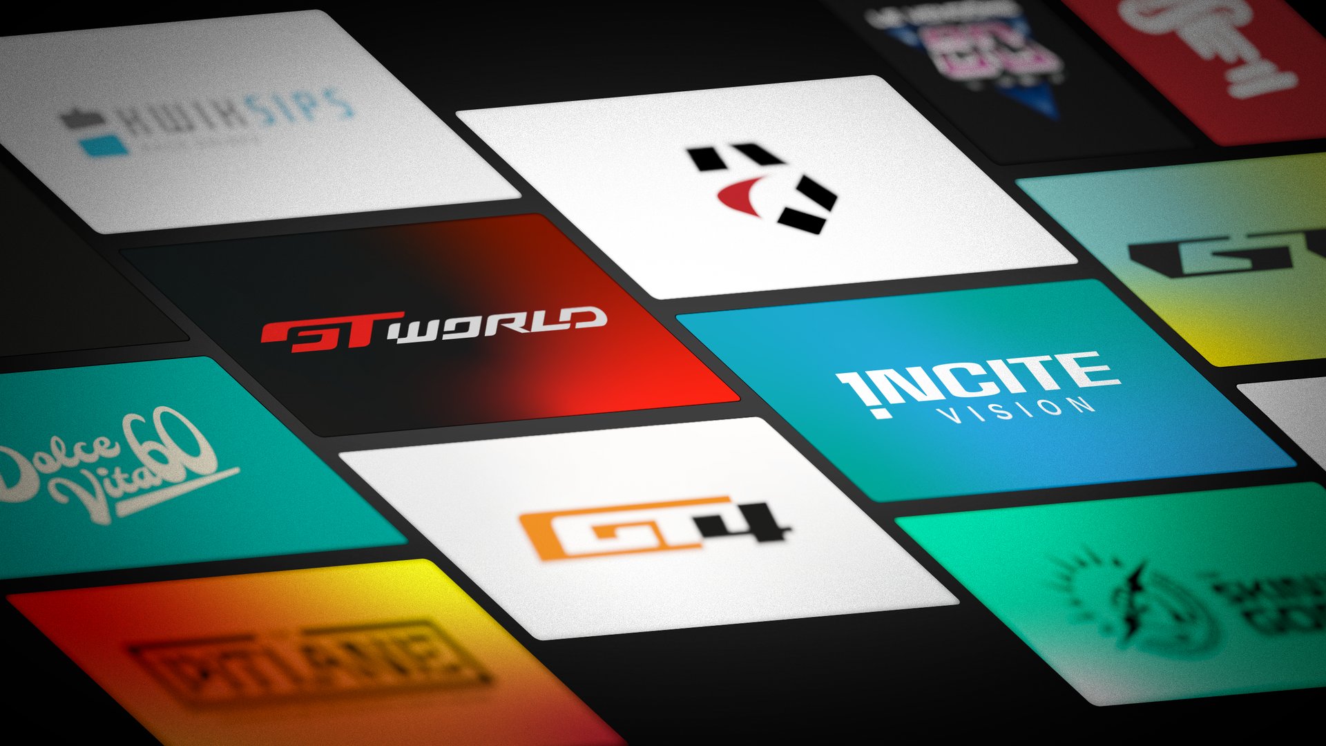
FOCUS ON GT WORLD BRAND
The foundation was a logo that embodies dynamism and modernity, blending sharp lines with fluid curves while staying true to SRO’s signature color palette. This ensured visual cohesion and brand recognition.
The cropped "G" shape was intentionally designed with open space, allowing for the integration of national flags—enabling tailored promotional materials for regional events.
The logo icon became the cornerstone of the entire visual system, consistently reinforcing the series’ identity and solidifying the GT marque as a distinctive and unified brand.
DESIGN APPROACH
BUILDING THE
BRAND SYSTEM
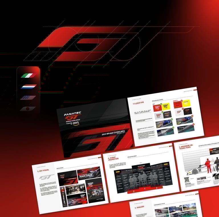
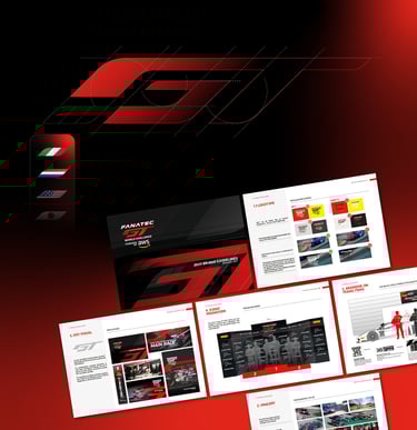
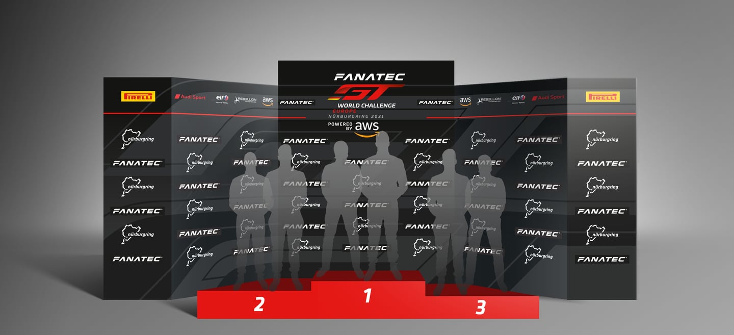
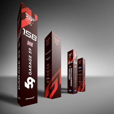
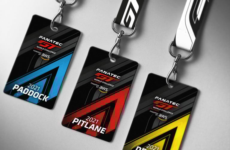
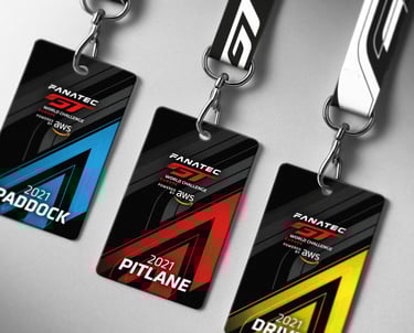
With the core identity established and brand guidelines in place, I developed a comprehensive suite of collateral materials.
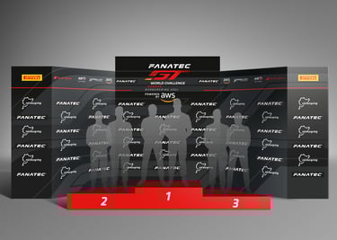
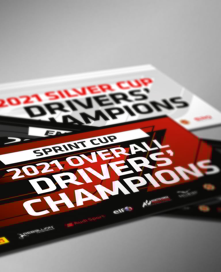
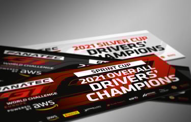
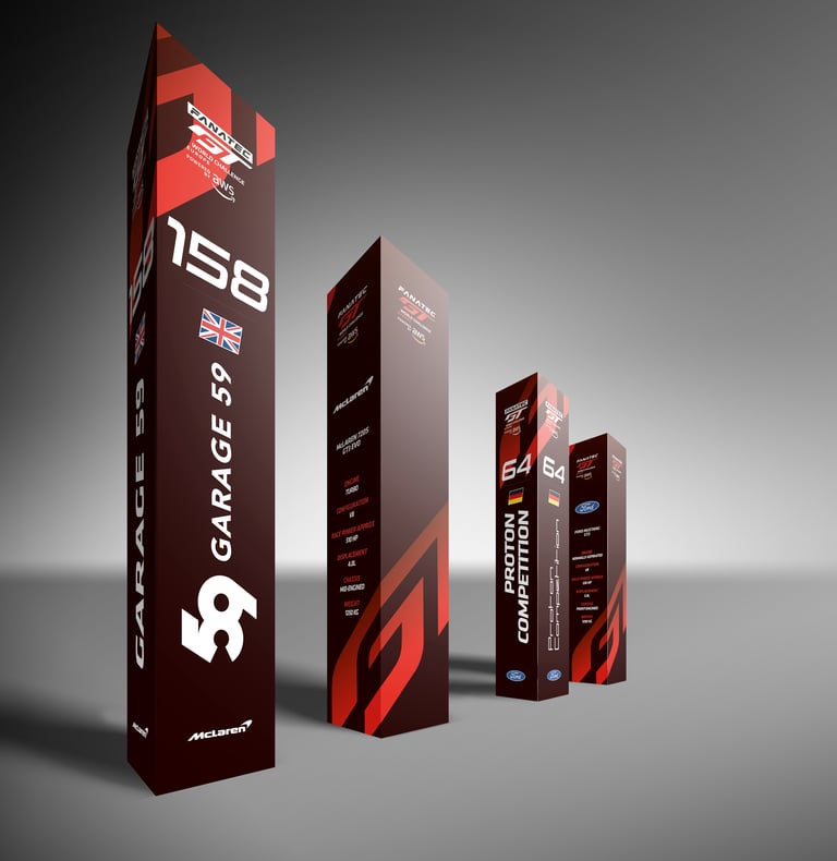
This included everything from marketing presentations to event assets—such as podiums, credentials, and paddock banners—ensuring a cohesive and impactful brand experience across all touchpoints.
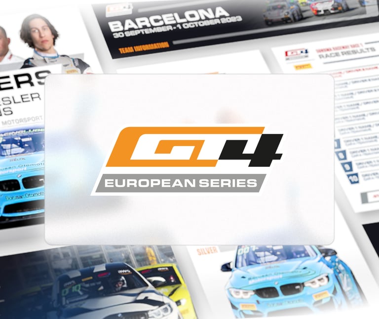

GT4 Series
Brand Identity
© SRO MOTORSPORTS GROUP
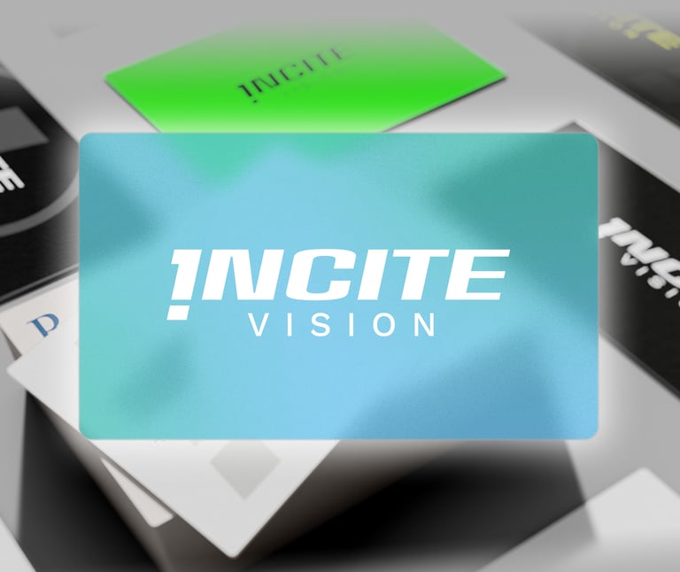
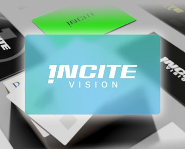
Incite Vision Sport MARKETING AGENCY
Brand Identity
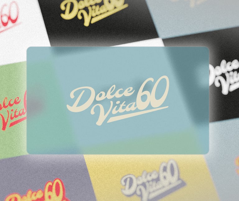
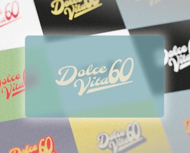
DOLCE VITA 60 Rally
Brand Identity
© SRO MOTORSPORTS GROUP
SIMILAR PROJECTS
Graphic designer specialised
in sport.
Contact
contact@smourlan.com
© 2025 Sebastien Mourlan. All rights reserved.

SEBASTIEN MOURLAN (EI)
Based in Toulouse, France.